Casa Kwantes – Rotterdam, The Netherlands
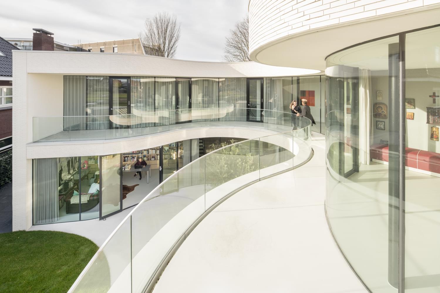
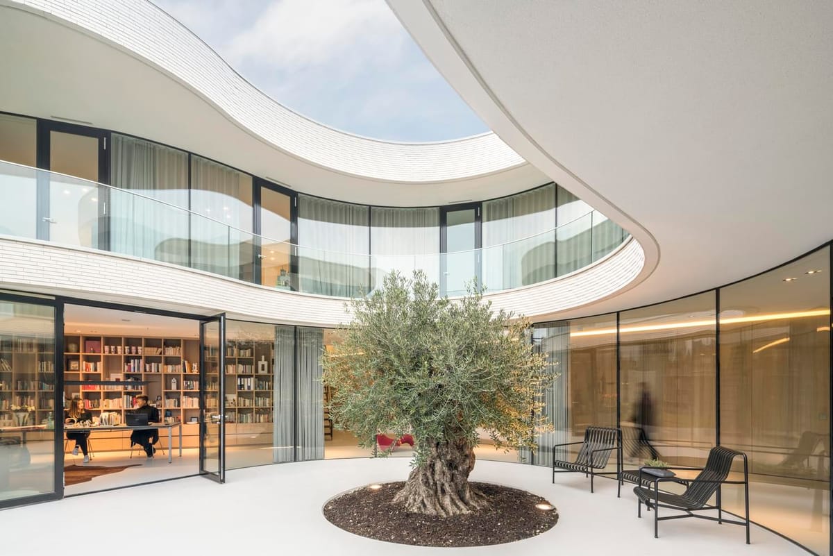
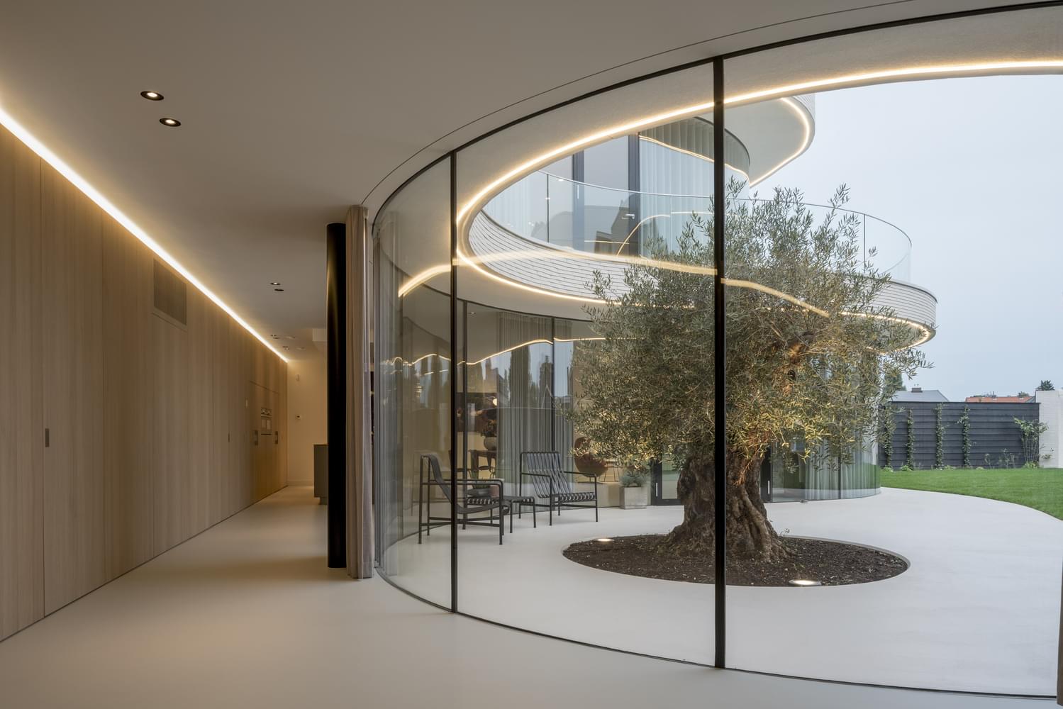
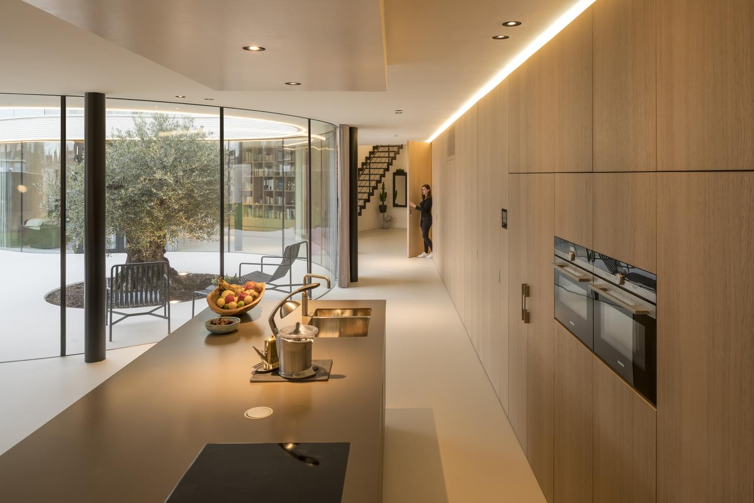
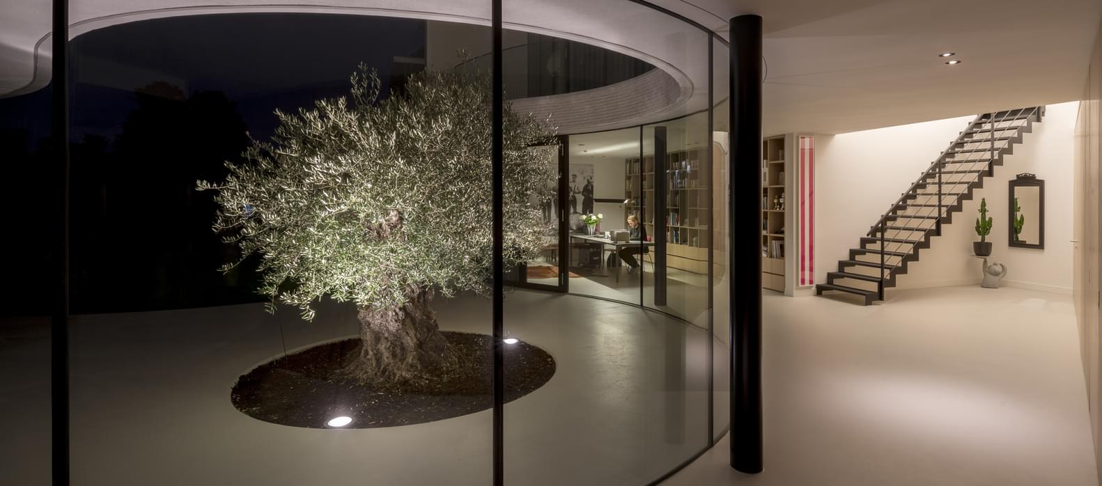
Casa Kwantes redefines residential architecture in the Netherlands. With its sculptural curves, sunlit atrium, and seamless indoor-outdoor flow, this home is both futuristic and deeply rooted in minimalist living.

We love projects – buildings, interiors, products, events, experiences, stores – that combine well considered elements in a surprising way.
We are not looking for gimmicks or tricks, or pretentious unrelated ‘touches of whimsy’ that only make the entire project seem empty and uninspired.
It is not easy to pull this off because it requires of the designer, architect, idea person a deep understanding of what belongs and what does not. And it requires an initial, crystal-clear vision of what one wants to accomplish.
It is much easier to keep adding than it is to leave out, which is why so much of what we see is just copies of existing works, or uninspired and uninspiring me-too blandness.
At times it seems that much of what we see is in fact draft-level work, unfinished sketches of someone too lazy or timid or vapid to try harder and actually keep working till something worthwhile emerges.
Subtle is difficult. Bold and original is difficult.
This sermon was inspired by MVRDV’s much-talked-about Casa Kwantes that in its apparent simplicity manages to be both original and absolutely stunning. What does not belong is not there.
It is a 480 square meter (5,166 sq.ft) single-family home on a corner lot in Rotterdam.
To meet the municipal retro-style architecture requirements, the architects conjured up a fresh take on 1930s modernism.
We love the closed, square back and the open and rounded front. We love that the inner and outer environments are so different yet so beautifully connected with the minimalist white.
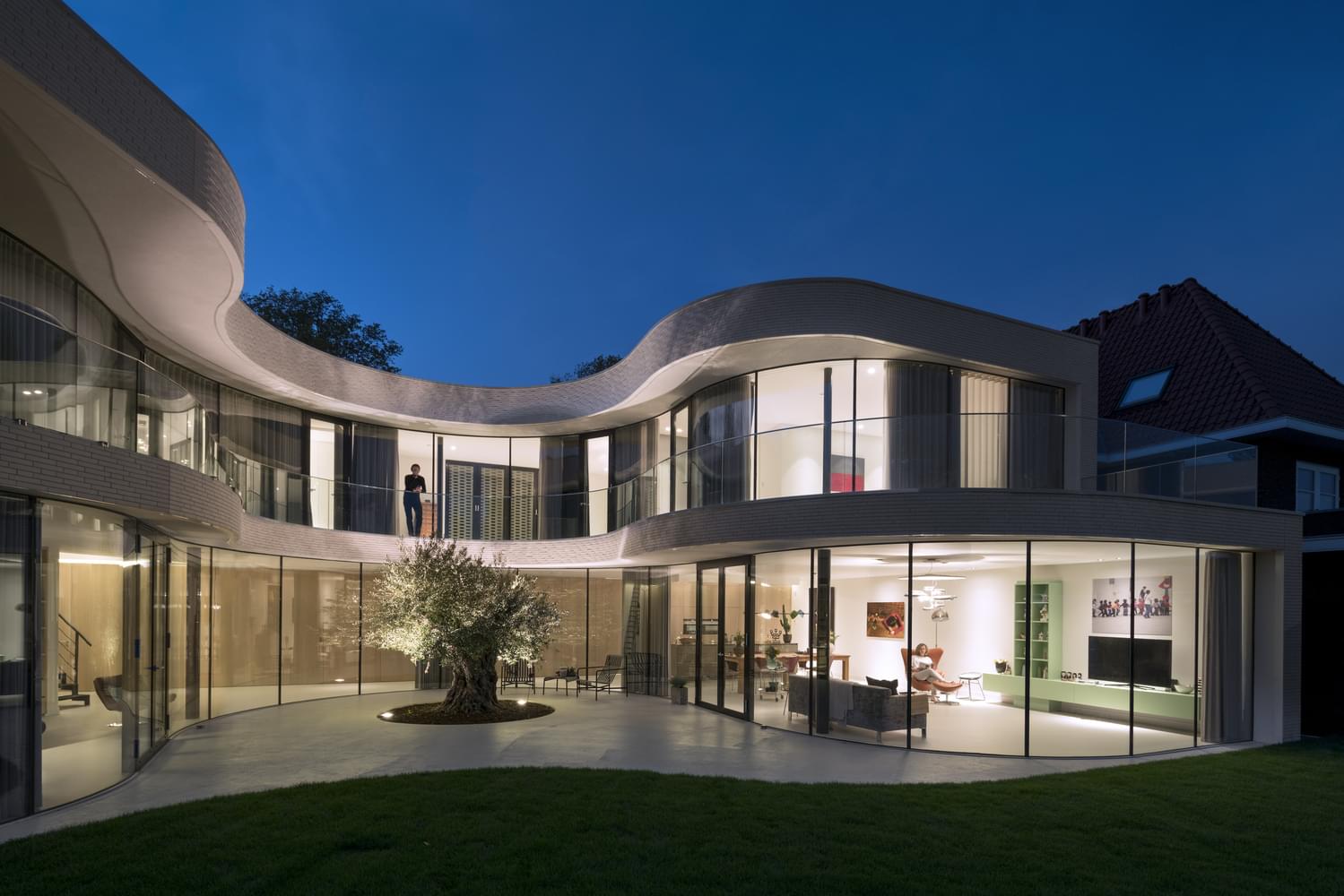
It doesn’t hurt at all that the structure hugs a tiny olive tree, a gesture that gives the entire home a lovely, friendly feel. Perfect. Tuija Seipell.
